Rangle.io - Experience Design Intern - Winter 2019
E-Commerce Design System
Rangle.io is a development and design consultancy that works with clients to create new digital experiences. Here, I was put on a fully-equipped team of designers, developers and strategists for a athletic apparel retailer. Our holistic goal was to create a design system for their e-commerce experience. Throughout the term, I worked alongside UX and Visual designers, while collaborating closely with the client. My end goal was to create consistent and reusable design components for the design system.
Overview
Problem Space
The client's in-store experience does a great job of indulging consumers into the world of sports with their expertise and hands-on opportunities. Unfortunately, these physical features are not translated digitally, lagging the client behind their competitors. Additionaly, there is little cohesion between existing online pages, as each flow belongs to a different team.
The system would act as a single source of truth - being transparent and adaptable in order to create innovative customer experiences. The scope of this project will focus on the product selection and detail pages.
Design Process
The double-diamond design process gives all team members the time to conduct extensive exploration in an agile environment before building out thoughtful concepts. This approach created a continuous improvement and feedback loop which allowed us to constantly validate our designs throughout development.
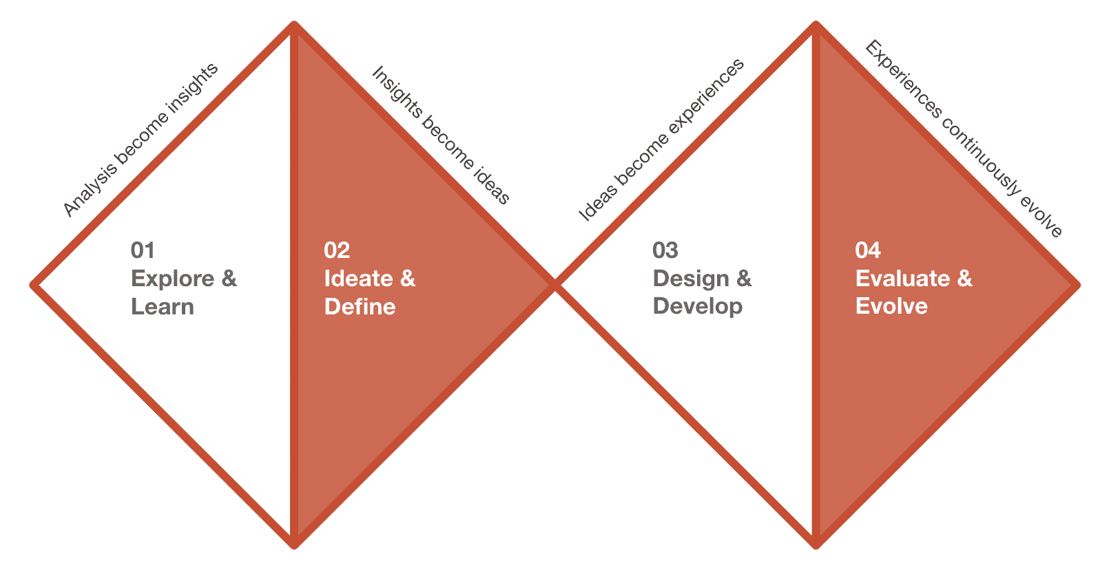
Rangle.io's Double Diamond Approach
Discovery
UX Assessment
Before diving into the development of components, the UX team took a step back to assess the current e-commerce experience and to learn best practices that we would want to implement. This also included a competitive analysis which entailed looking at leading shopping platforms in and out of industry to give us more context about the space.
Usability Audit
I began by exploring the current version of the e-commerce flows. During this I noted any current usability issues that would need to be addressed with the design system. By organizing these in a table, the team could prioritize and assess which components would need to make it in the MVP system.

Usability Issues Examples
User Testing
In order to confirm our initial assumptions and hypotheses, I conducted six usability tests with potential users using both the desktop and mobile websites.
Some prominent issues that came out of the sessions were...
- Error messaging is unclear resulting in ambiguous actions
- Users are unable to understand shipping options
- Filters are fixed and require scrolling for users to modify their selections
- Users are unable to edit items during checkout
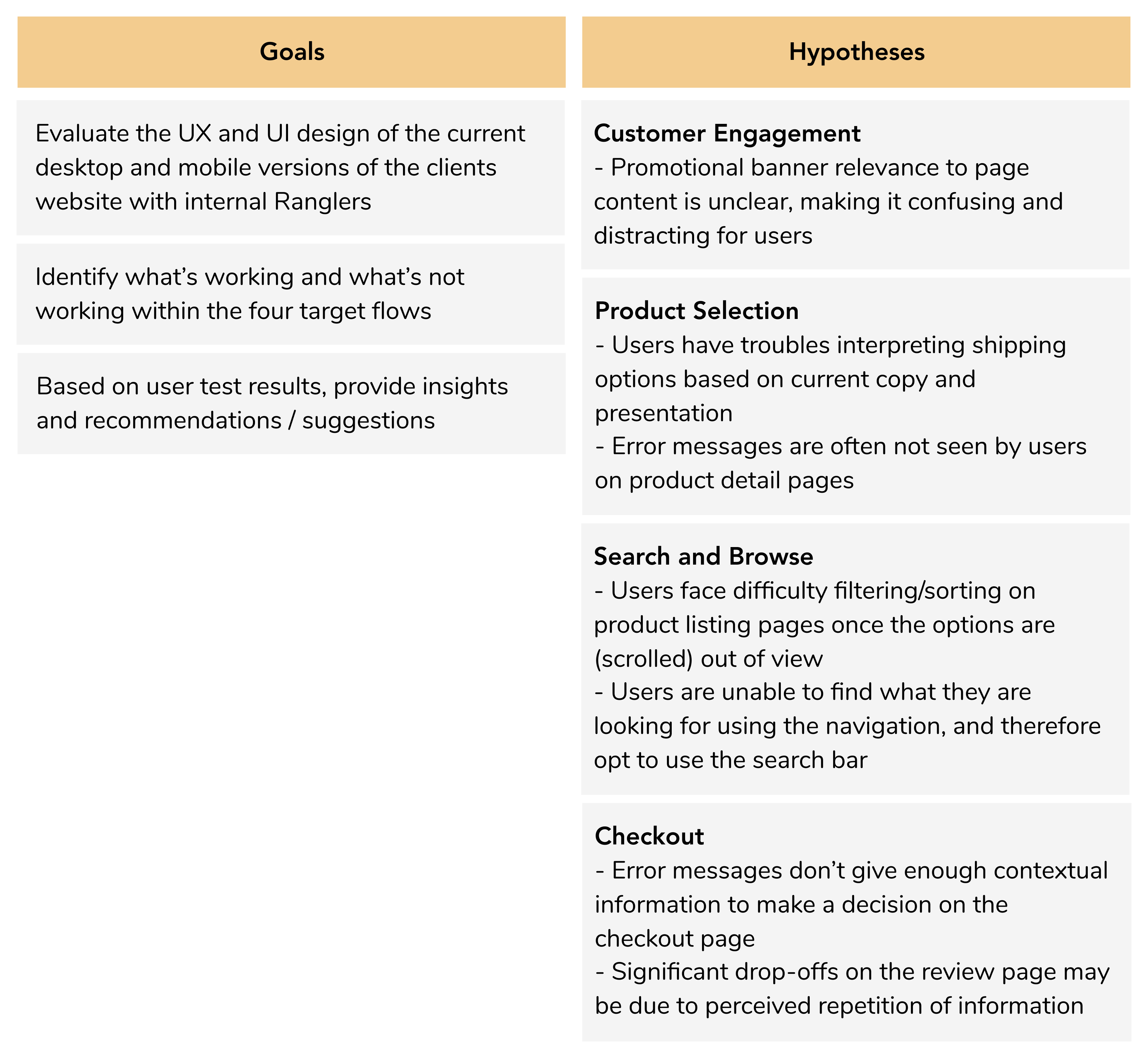
Usability Testing Goals and Hypotheses
Design Process
Flow Exploration
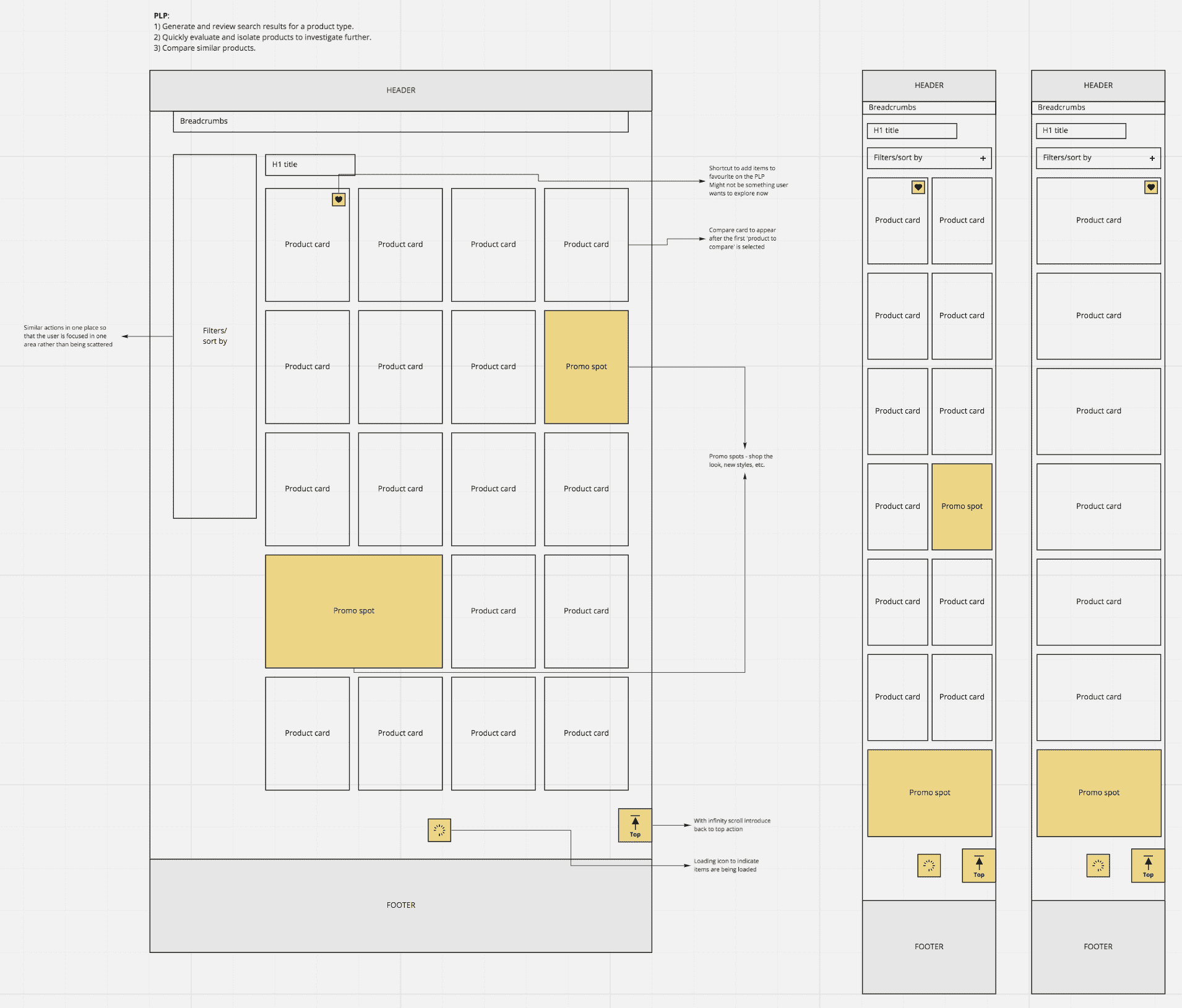
Designing high-level layouts allowed me to get a big-picture view of what the site would look like without getting tied down to granular details. It further helped the team understand the inventory of components we would need to create, while building out a structure for the content. I also established the jobs-to-be-done for each page to ensure that the designed experience would help accomplish them.The product listing page jobs were:
- As a shopper, I want to generate and review search results for a product type in order to find what I'm looking for.
- As a shopper, I want to quickly evaluate and isolate products in order to investigate them further.
- As a shopper, I want to compare similar products to learn which one I prefer.
Potential Content Page Examples
Ideation
From these building blocks, I could begin creating one feature at a time. Throughout the design process, I refered to the usability issues noted earlier, as well as the competitive analysis to verify that the new user experience would tackle these problems. Taking this systematic approach also ensure the re-usage of as many styles and components as possible.


Product Card Ideation
Wireframing
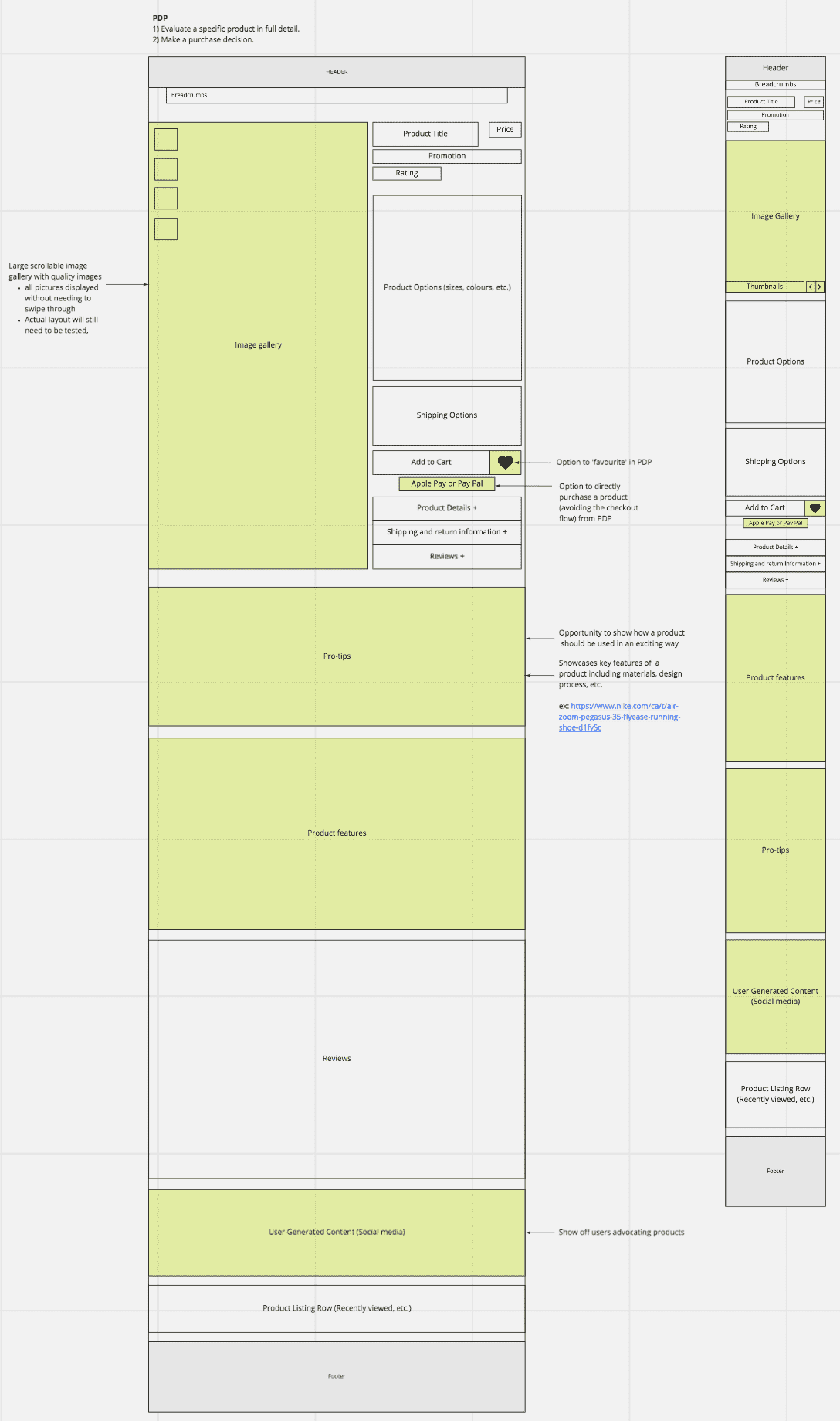
Although my end goal was to create components for a design system, I designed hypothetical layouts to see the holistic view of everything together. These blueprint content structures would then inform which components we would need and how they would be grouped. Collaboration with developers and visual designers was most crucial here, as styles, grids and spacing became important factors.

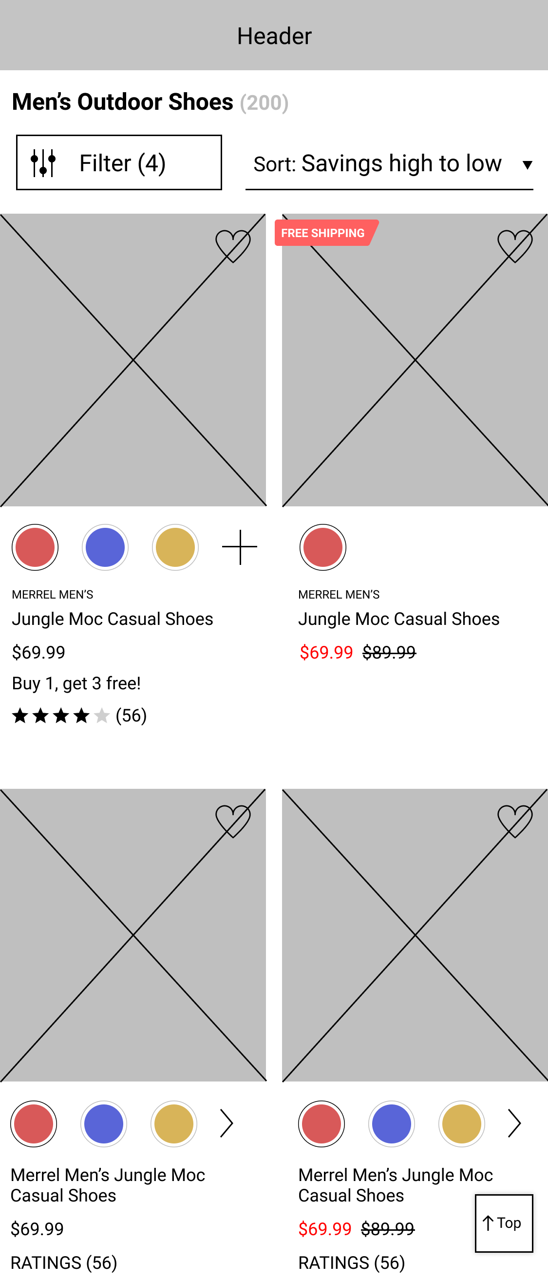


Product Listing Page and Product Details Page Wireframes for Desktop and Mobile
Mock-ups
My favourite part was working with the visual designers to realize the wireframes into high-fidelity mock-ups. This is also when visual accesibility became absolutely crucial to consider. This style of work allowed me to continue improving my visual design skills through collaboration.
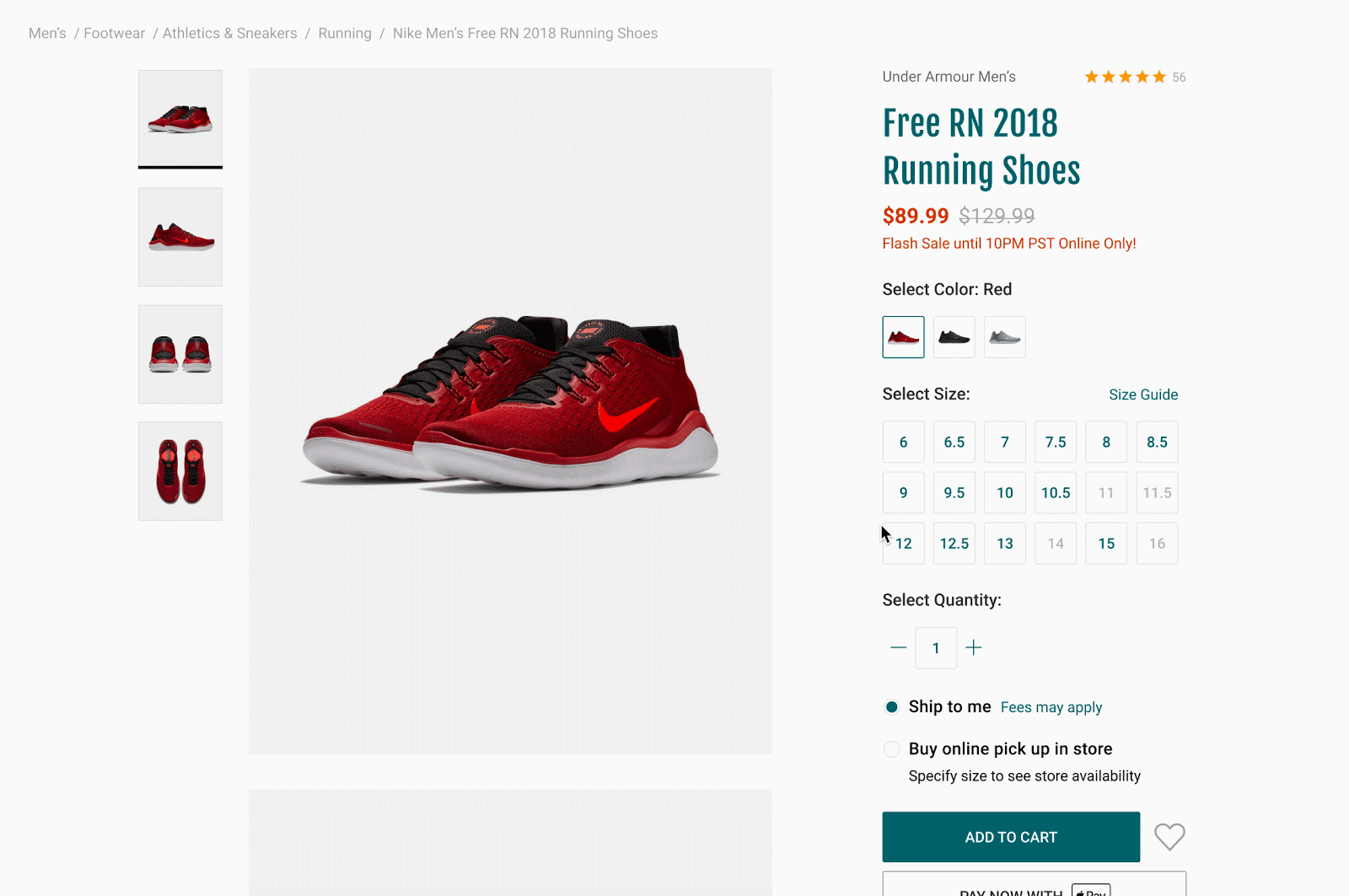

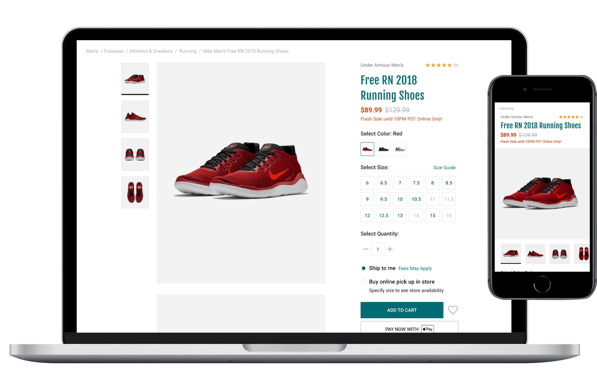
High-fidelity Mock-ups
Developer Hand-off
From here, both developers and designers worked together to scrape components from the created mock-ups. Components were split into feasible parts that worked for development and would be simple to re-use and iterate upon in the future. It also helped both the technical and design teams understand the difference between elements, features, and patterns and how they would be documented. Each component was then highlighted and named with its key criterias and requirements.
Reflection
Next Steps
Components would be designed one at a time while accounting for all use cases, states, and variations. Then they would be passed onto the development team to implement and to the content team for documentation. Additionaly, while my team worked on creating components - another team of designers was working in parallel to build out the documentation site. These two streams of work would then finally come together and accomplish the project goal of creating an MVP design system!

PDP Use Cases
Learnings
Design systems encapsule so much more than just a documented style guide. Actually taking part in the creative process showed me the complexity and the amounts of precision and documentation that are needed for each individual component.
I also learned the importance of well-documented research throughout a design process. Continuously documenting and organizing work in an accessible format, allowed me to easily reference previous research while designing layouts and components. Furthermore, it made sure that that all of our designs were backed-up with previously collected data.