Postmedia I/O - UX Design & Research Intern - Spring 2018
Postmedia Hub
The Postmedia Hub is a marketing analytics platform designed for clients to track online marketing efforts. Throughout my work term, I lead a research initiative in order to learn more about existing clients and to discover what I can do to improve the user engagement of the platform. I worked closely with a product manager, senior designer and team of developers.

Overview
Problem Space
The MVP solution for the Postmedia Hub was quickly developed while giving little importance to the users and their actual needs. This resulted in a platform with low user retention that clients have a difficult time understanding. We needed to better understand...
- Who are the current users?
- Which Postmedia clients are not currently using the Postmedia Hub and why?
- What possible short-term and long-term solutions could we implment to improve user retention?
User Research
Behavioural Archetypes
I began my research by conducting user interviews to learn more about clients' backgrounds and knowledge about marketing solutions. With the key insights I found, I created brief market profiles and began building behavioural archetypes. Like this, I was able to create a number of different archetypes, each with unique attributes and goals. These helped developers and product managers find empathy for the users and gain awareness about the current client base. Furthermore, this helped me learn what to consider when designing new retention solutions.
Development of Behavioural Archetypes
Behavioural Matrices
After creating unique archetypes, I wanted to dive deeper and learn about users' current actions. With a Jobs to be Done framework and the help of a user interaction tracking tool, Mixpanel, I noted the different actions users were performing within the platform. With the provided data and my learnings from users, I placed the archetypes on multiple behavioural matrices. These gave a hollistic view of where users currently lie and where they should strive to be. This also showed the definitve direction that the product should be heading towards, which was shared with directors and executives.
Behavioural Archetype Matrices
Journey Mapping
I also began to draft a user journey by taking the users' wants and needs and pin-pointing them on a map. With this mapping, I was able to capture users' current experiences with and without the Postmedia Hub.
Development of the Hub User Journey Map
Findings
Through this extensive research, I learned that clients don't need a platform to learn about complex marketing tactics, but a place to see how their business is performing and what they need to know to move forward.
Without benchmarking and comparison tools, customers are unable to receive the insight that they get from their sales consultants, therefore making the Postmedia Hub a lost tool.
Solutions
On-boarding
By looking at the User Journey map, I found that clients were most confused when entering the Postmedia Hub because of a lack of training. An engaging new onboarding process would be a great start to building retention with new users. With a strong foundation, the metrics found in the Postmedia Hub would be easier for them to understand.
First onboarding sketches
The development of a new onboarding process started with researching the best existing application onboarding processes; performing a competitive analysis. Explorations included looking at existing onborading processes from DuoLingo, Slack, and competitor applications. By taking into account users' current frustrations, I wanted the onboarding process for Postmedia Hub to be:
- Friendly, but not childish
- Informative, but not overwhelming
- Supportive, but not demeaning
Low-Fidelity Onboarding Protypes
The team's goal was to show clients the value of the product while learning a little more about them. Therefore, I combined some of the best in-class onboarding processes into a core flow with four distinct parts:
- Introduction Email
- Client Survey
- Registration
- Product Tour
Select screens from the High-Fidelity Onboarding Prototype
Integrating Insights
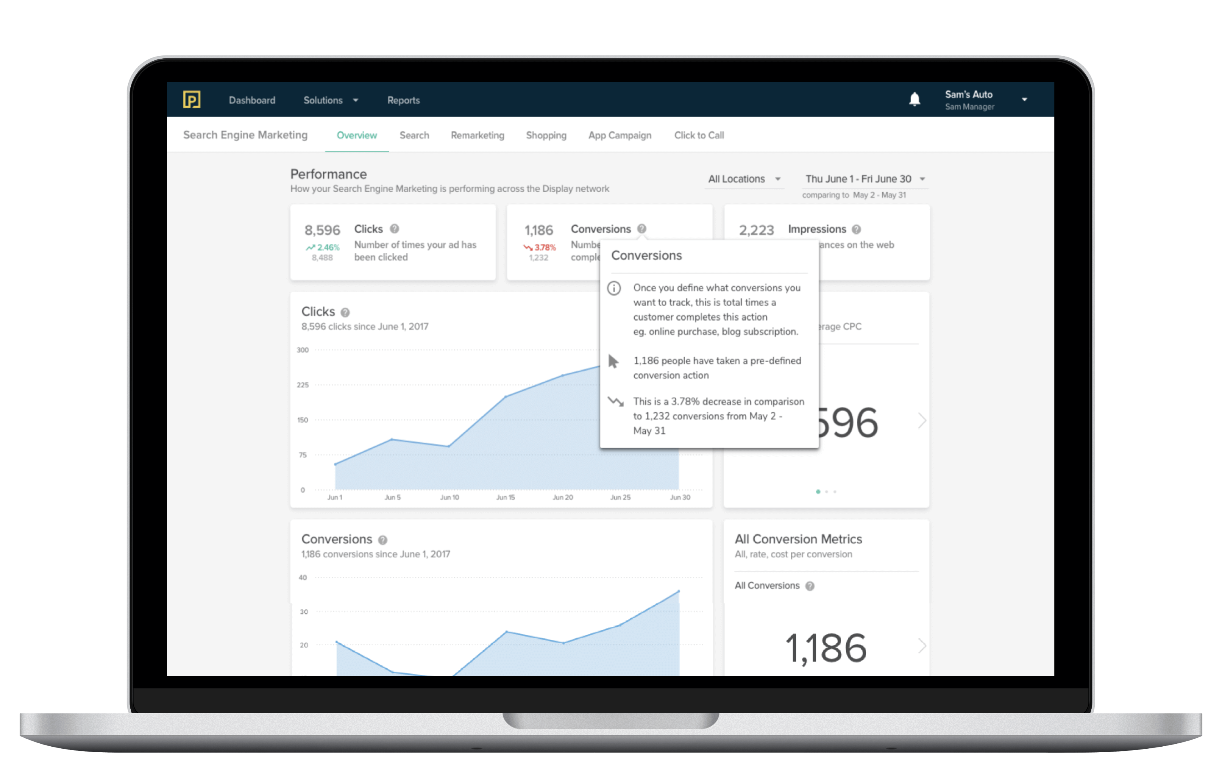
I also looked at short term solutions that could be quickly implemented to give value to the existing metrics. Taking inspiration from the performance display of stocks, I designed a tool that showed how clients' businesses were performing in comparison to previous date ranges. The use of colour and icons built visual hierarchy making these metrics readable and intuitive.
Postmedia Hub originally vs. with insights
Tool-tips
Following the addition of insights, I also took the time to re-design the current tooltip. Newly incorporated insights would be explained in depth in the tooltip. The new design was scaleable and the details could eventually be expanded into their own metric cards.
Examples of the original tool-tip vs. new tool-tip
Reflection
Next Steps
In order to ensure the value of the proposed solutions, I recommend to test each one with existing and non-existing clients. Although the onboarding process was built based on best practices and previous learnings - it is important to validate each design before implementing it. Furthermore, integrating more insights into the platform will only make it grow stronger. Adding comparison tools and showing clients how they are performing against vertical competitors, will help them make informed decisions for their businesses.